# Interface
TODO
# Design considerations
TODO
# UX: User Experience
TODO
# Mobile first or desktop first
TODO
# Designers and developers
TODO
# Building the interface
After setup the scaffolding you are ready to start building the app. Let's add some stuff and get this going.
App.vue holds the main code. Here we see our basic app structure from the template:
<template web>
  <div class="w-page">
    <div class="w-container">
      <img src="~/assets/logo.png" alt="logo" height="20%" width="20%" />
      <HelloWorld :msg="msg" />
    </div>
  </div>
</template>
<template native>
  <Page>
    <ActionBar :title="navbarTitle" />
    <GridLayout rows="auto, auto">
      <HelloWorld :msg="msg" />
    </GridLayout>
  </Page>
</template>
At this point we have a very basic scaffolding, with a HelloWorld component. So let's structure it a bit better. On the web view we need the header, footer, and the router to hold the data structure, which we'll see in the next section. On the native view, we want a drawer.
So let's create it:
<template web>
  <div>
    <SiteHeader></SiteHeader>
    <keep-alive :max="10" include="Home">
      <router-view :key="$route.fullPath"></router-view>
    </keep-alive>
    <SiteFooter></SiteFooter>
  </div>
</template>

<template native>
  <RadSideDrawer
    ref="drawer"
    drawerLocation="Left"
    gesturesEnabled="true"
    :drawerTransition="transition"
  >
    <StackLayout ~drawerContent backgroundColor="#ffffff">
      <slot name="drawerContent"></slot>
    </StackLayout>
    <frame ~mainContent ref="drawerMainContent">
      <slot name="mainContent"></slot>
    </frame>
  </RadSideDrawer>
</template>
As you see, both native and web templates are here. We'll configure the main app slightly different for each, since we have to handle routing and the special structure of each version, so in this case we'll use two separate scripts. We only import what we need and move on:
<script native>
  import {
    SlideInOnTopTransition,
    RadSideDrawer,
  } from "nativescript-ui-sidedrawer";

  export default {
    name: "App",
    components: {
      RadSideDrawer,
    },
    data() {
      return {
        transition: new SlideInOnTopTransition(),
      };
    },
  };
</script>
<script web>
  import SiteHeader from "components/web/SiteHeader";
  import SiteFooter from "components/web/SiteFooter";

  export default {
    name: "App",
    components: {
      SiteHeader,
      SiteFooter,
    },
  };
</script>
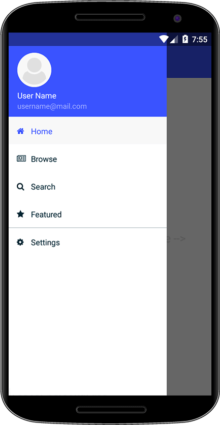
So, in the native mode, we need to implement our side drawer. This is a list of links, each one routing to a specific page. Let's see the main XML for this:
<template lang="html">
<GridLayout rows="auto, *" class="nt-drawer__content">
<StackLayout row="0" class="nt-drawer__header">
<image
class="nt-drawer__header-image fas t-36"
src.decode="font://"
></image>
<label class="nt-drawer__header-brand" :text="userName"></label>
</StackLayout>
<ScrollView row="1" class="nt-drawer__body">
<StackLayout>
<GridLayout
columns="auto, *"
:class="
'nt-drawer__list-item' +
(selectedPage === 'Home' ? ' -selected' : '')
"
@tap="onNavigationItemTap(Home)"
>
<label col="0" text.decode="" class="nt-icon fas"></label>
<label col="1" :text="Home" class="p-r-10"></label>
</GridLayout>
<GridLayout
columns="auto, *"
:class="
'nt-drawer__list-item' +
(selectedPage === 'My posts' ? ' -selected' : '')
"
@tap="onNavigationItemTap(Posts)"
>
<label col="0" text.decode="" class="nt-icon fas"></label>
<label col="1" :text="Posts" class="p-r-10"></label>
</GridLayout>
<StackLayout class="hr"></StackLayout>
<GridLayout
columns="auto, *"
:class="
'nt-drawer__list-item'
"
@tap="onNavigationItemTap('logout')"
>
<label col="0" text.decode="" class="nt-icon fas"></label>
<label col="1" :text="Logout" class="p-r-10"></label>
</GridLayout>
<GridLayout
columns="auto, *"
:class="
'nt-drawer__list-item' +
(selectedPage === 'Settings' ? ' -selected' : '')
"
@tap="onNavigationItemTap(Settings)"
>
<label col="0" text.decode="" class="nt-icon fas"></label>
<label col="1" :text="Settings" class="p-r-10"></label>
</GridLayout>
</StackLayout>
</ScrollView>
</GridLayout>
</template>
This introduces the layout used by Nativescript. Instead of the usual HTML structure of divs, in native development we have a few layout classes. They are not nice, and often do even less what you want than CSS. But there's half a dozen of them to get used to. In this case we have a base grid with a logo, our username, and a stack with links and icons. This code follows the drawer navigation template from NS docs, so you can get more information about it there. The routing code is missing; we'll get to it soon. Our app base is ready to go.
# Good practices for HTML/CSS
If you have developed a web project before you know how HTML quickly becomes full of classes and weird tags, and starts to break unexpectedly if you change one class name. So here's a list of good practices:
- don't use the same class names for style and for JS. This has been less of an issue now with reactive frameworks than in the past with pure JS or Jquery, but occasionally we still need selectors for JS code. If you do, use class names for the code structure, not for design.
- use robust selectors.
div > div > ol > li > spanis easy to break, whileol.numberListorli.numberItem > span.acronymare much more robust.\ - use a standard such as BEM, OOCSS, SMACSS, SUITCSS for naming. We'll talk about BEM next.
# BEM
The Block, Element, Modifier methodology (known as BEM) is a popular naming convention for classes in HTML and CSS.
In this convention we have:
- a block is a top-level abstraction of a component, which is meaningful on its own. Examples: a button:
.button,.menu,.post. - an element is a child item inside a block. These are denoted by two underscores following the name of the block. Examples:
.btn__nameor.post__title,.menu__item. - a modifier can manipulate the block or element to change appearance or behavior. These are denoted by two hyphens following the name of the block/element. Examples:
.btn--disabledor.post__title--big,.menu__item--highlighted.
Here's a quick example of a BEM structure for a fictional post-card element:
.post-card {
  width: 100%;
}

.post-card__title {
  font-weight: bold;
}

.post-card__title--big {
  font-size: 120%;
}
Note that BEM styles should not be nested (though you can have a block modifier affecting its element). This makes CSS specifity flat. It allows you to have elements containing other elements easily.
<div class="post-card">
  <div class="post-card__title post-card__title--big">
    My title
  </div>
</div>
BEM provides modularity, making it easy to share components with other projects and avoid cascading.
# CSS Preprocessors
A number of CSS preprocessors have been developed to make CSS development less verbose and easier. The two most used are LESS and Sass. Their syntax is slightly different, but both have more or less the same features. The choice is yours, and may be influenced by the CSS library that you're going to use. Bootstrap and Bulma, for example, are written in Sass, so it might be easier to adopt Sass if you want to include their original code to customize it yourself.
$ yarn add --dev node-sass sass-loader
Using less is just the same as using Sass, but with its own packages:
$ yarn add --dev node-less less-loader
# Sharing CSS between native and Web
Nativescript uses CSS for much of its layouting, but in the end things are so different in the web and native versions in this aspect that it's not worth trying to have a single CSS code base, though we can share variables and some styles. We'll structure three entry points for our CSS, Android, iOS and web. Android and iOS will share most of the code, but this enables us to add individual styles too. We're again following TNS structure and adding a new directory for web.
- src/app.ios.scss
- This is the main file for the iOS version.
- src/app.android.scss
- This is the main file for the Android version.
- src/_app.common.scss
- This is the common file for the native versions.
- src/scss/
- We're placing all the internal SCSS native files into this directory.
- src/scss/web/
- We're placing all the web SCSS files into this directory.
There's an important point to pay attention here. In many tutorials you'll see the <style></style> code in the SFC Vue files importing SCSS. This works but results in a huge bloat, because it imports the files again and again, copying them. The only safe files to import in the style tag are pure variable files.
You can decide on how to organize your code. I tend to place styles that are shared on the entire application on the project CSS files, while small and standalone components that can be shared with other projects will have it's BEM-style code in the SFC itself.
# Bulma
As an example, we'll setup this project with Bulma for the web version, but the same instructions are valid for Bootstrap or other CSS frameworks. Bulma is written in SCSS, which is why we'll use it here. We'll show here how to use variables to customize Bulma.
Our entry point for the web CSS structure is at src/scss/web/index.scss. It loads the rest of the files. Here's the file. We start by importing our shared variables.scss for things we share with the native build, such as colors. Then we set a few variables from Bulma to customize it. We also include anything else we'll need, such as fonts and stylesheets from plugins.
@charset "utf-8";

// Import only what you need from Bulma
@import "../variables.scss";

// Set your brand colors
$primary: $color-primary-0;
$link: #46a2db;
$info: #4887b1;

$body-font-size: 1.1em;

$backgroundColor: #d6e6d4;
$fieldBackgroundColor: $color-primary-4;
$fieldInvalidBackgroundColor: #7e2933;
$gridSize: 940px;
$mobile: 540px;
$family-sans-serif: "Arimo", "sans-serif";

/*
 * External deps
 */
@import "~bulma/bulma.sass";
@import "~buefy/src/scss/buefy";
@import "~typeface-arimo/index.css";
$fa-font-path: "~@fortawesome/fontawesome-free/webfonts/";
@import "~@fortawesome/fontawesome-free/scss/fontawesome.scss";
@import "~@fortawesome/fontawesome-free/scss/solid.scss";
@import "~@fortawesome/fontawesome-free/scss/brands.scss";

// internal SCSS files go here
Note how we handle fonts here. We're going to self host them instead of loading them from CDN to show how to do it -- but you could load from CDN instead if you prefer. The typefaces npm package allows us to download the Arimo font (or other open source fonts you want). We also include the FontAwesome fonts; we set $fa-font-path to correctly build them. Since we're using Vue, we also include Buefy as a helper. Below this initial include we add our internal @imports for our own SCSS code.
# Header and footer
For our web version, let's create a standard header and footer for the site, and a landing page.
public/index.html holds the basic HTML data. It's good to add some metadata, such as
OpenGraph data, to it.
Let's create src/components/web/SiteHeader.vue and src/components/web/SiteFooter.vue. This follows your usual HTML code, there's not much to say. In the next section we'll talk about routing and talk a bit about the header and footer again, explaining how to do its links.
# Native layout
As related about, the _app.common.scss file only includes files, working as a secondary entry point:
// basic theme from TNS
@import "~@nativescript/theme/core";
@import "~@nativescript/theme/orange";

// include our own code here
@import "scss/variables.scss";
@import "scss/fonts.scss";
@import "scss/button.scss";
@import "scss/post.scss";
@import "scss/page.scss";
And our Android and iOS SCSS files include this one and any code specific to its platforms. The NS theme handles most things and follows the platform UI guidelines, so in general there's very little to do. The most useful things are configuring button colors, section and elements paddings and fonts.
You'll need to embed your fonts on the native apps. Let's add
FontAwesome to our project. In src/fonts, place the .ttf files.
We're going to define base classes for the fonts on the SCSS files, which include the file names. The build
system will find the assets and load them into the packages.
// Font icon class
.fab {
  font-family: "Font Awesome 5 Brands", "fa-brands-400";
  font-weight: 400;
}

.fas {
  font-family: "Font Awesome 5 Free", "fa-solid-900";
  font-weight: 900;
}

.far {
  font-family: "Font Awesome 5 Free", "fa-regular-400";
  font-weight: 400;
}
This concludes our overview of how to style and build the base interface of our application.